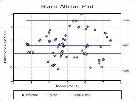
5.3.5. Bland-Altman Plot
The Bland-Altman plot (which is also known as Difference Plot or Tukey Mean Difference Plot) aims to show whether the difference between two methods is significant.
In its simplest form, the differences between observation pairs are plotted against their mean and the mean difference and its 95% confidence limit lines are drawn on the same plot.

5.3.5.1. One Measurement Per Subject

Select two columns of data using the [Column 1] and [Column 2] buttons on the Variable Selection Dialogue. The next dialogue offers the following selections for axes:

X-Axis Options:
Mean: This is the recommended default option. The average of the two measurements is plotted.
Column 1: If the method represented in Column 1 is a proven benchmark method, you can plot the differences against this method, rather than the average of the two methods.
Column 2: If the method represented in Column 2 is a proven benchmark method, you can plot the differences against this method, rather than the average of the two methods.
Geometric Mean: This is mostly used when the Y-Axis represents ratios. The ratio / geometric mean options are useful when the original data was subject to a logarithmic transformation and the results are to be transformed back to the original scale.
Y-Axis Options:
Difference: This is the recommended default option. The difference between the two measurements is plotted.
% Difference: 100 x Difference / Mean is plotted for each pair.
Ratio: This is mostly used when the X-Axis represents geometric mean. The ratio / geometric mean options are useful when the original data was subject to a logarithmic transformation and the results are to be transformed back to the original scale.
By default, the 95% confidence intervals are displayed for the mean and 95% confidence lines. For further information see Bland & Altman (1999). You can omit these lines by selecting None for the Line Type on the Data Series dialogue that can be accessed either from the Edit → Data Series menu or by double-clicking on the graph area.

The standard X-Y Plots utilities like fitting a trend line or labelling the individual points are also available in this procedure.

5.3.5.2. Repeated Measurements Per Subject
If the data contains more than one observation per subject, it is divided into subgroups as described in section 7.3.0.1. ANOVA and GLM Data Format. In this case the program will display a list of subgroups as defined by the factor column, allowing you to choose which subgroups to include in the analysis. The unchecked levels will be excluded from the plot. The groups may be defined by more than one factor variable, in which case a list of all possible combinations of factor levels will be displayed.

When there are repeated measures per subject, the confidence intervals can be computed by three alternative methods. For further information see Bland & Altman (2007). In this case one symbol is plotted for each subgroup whose area is proportional to the size of that subsample. There is a fourth option which disregards the repeated measurements and plots the individual pairs as in the previous section.
True value is constant: This is the recommended default option. Measurement errors are calculated using one-way analysis of variance for each method separately as described by Bland & Altman (2007) page 578.

True value varies: Measurement errors are calculated using a one-way analysis of variance for differences as introduced by Bland & Altman (1999) and corrected in (2007) page 576.

Group averages: Measurements are pooled for each subject and first and then plotted as individual pairs as described by Bland & Altman (2007) page 581. Note that the mean is different from the above two options.

Individual pairs: The individual pairs are plotted as described in the previous section and the division into subgroups is disregarded in all computations, except that they are represented by different symbols on the graph.

Examples
We have already reproduced above all examples in Bland & Altman (2007). The data set given in Table 1, page 572 can be found in the file BLAND-ALTMAN in UNISTAT’s Examples folder. Select Graph → Descriptive Plots → Bland-Altman Plot to run the procedure.
