2.3.4. Edit Menu
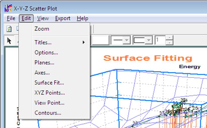
This menu provides access to dialogues used in controlling the specific features of each graphics procedure. Therefore, the menu items displayed under Edit will be different for different procedures. The two exceptions to this are the Titles and Options items, which are common to all graph types.
The following are the more commonly used Edit Menu options.
2.3.4.1. Zoom / Unzoom
Selecting this option is equivalent to clicking on the zoom button (with the picture of a magnifying glass showing the + sign). Zoom is used to display a smaller section of the graph in the plot area.
After selecting View → Zoom the mouse pointer will change into a cross-hair. Depress the left mouse button at the top left corner of the region to be zoomed (do not release the button yet), drag a box to cover the zoom region and then release the mouse button. A full size graph of the selected area will be drawn. After zoom has been used, a new button will appear to the right of the zoom button with a magnifying glass picture showing the – sign. Click on this button to restore the original graph.
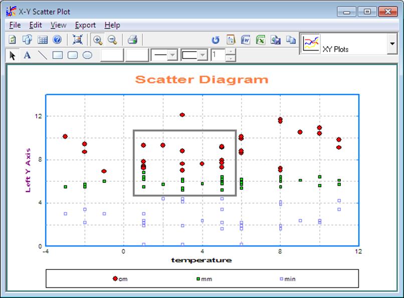
The zoom facility is not available for all graphics procedures.
2.3.4.2. Titles
Two standard text objects, Main Title and Sub Title can be entered, edited and their properties (like font, size, orientation, etc.) can be set. If either of these two have been deleted previously, they can be reinstated by simply entering new text in the text object dialogue (see 2.3.2.2.4. Text Objects). Other standard text objects can be edited from their own dialogues, e.g. axis titles from the Edit → Axes dialogue.
2.3.4.3. Options
Common aspects of all graph types, such as style, thickness and colour of frame, axes, tick marks can be controlled using this dialogue.
2.3.4.3.1. Tick Marks
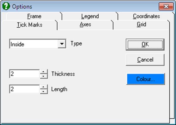
This dialogue is used to control the type, colour, thickness and length of the tick marks along the axes. The frequency of tick marks with or without labels can be controlled by selecting the appropriate interval values from the Edit → Axes dialogue. The controls on this dialogue have the following tasks:
Type:
None: Tick marks are not drawn.
Outside: Tick marks are drawn outside the plot area.
Inside: Tick marks are drawn inside the plot area.
Both: Tick marks are drawn both outside and inside the plot area.
Thickness: Adjusts the thickness of the tick marks.
Length: Adjusts the length of the tick marks.
2.3.4.3.2. Axes
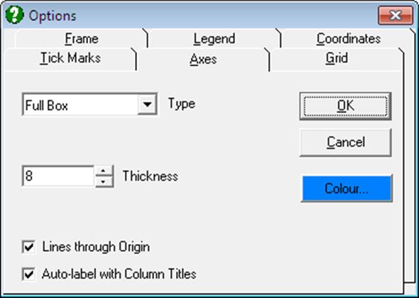
This tab controls the type, colour and thickness of the axis lines. To control the font and style of numbers printed alongside the tick marks and axis titles, a different dialogue, Edit → Axes is used.
Type:
None: Axes are not drawn.
Scales only: Only the primary axes with scales are drawn.
Full box: All axes are drawn.
Open box: Axes obscuring the graph area are not drawn (for 3D graphs only).
Thickness: Adjusts the thickness of the axis lines.
Lines Through Origin: If this box is checked and if the origin is in the plot area, then an axis line will be drawn passing through the origin.
Auto-label with Column Titles: When this box is checked UNISTAT will automatically assign the column label of the variable selected for this axis as the axis title. If this box is unchecked, the axis titles entered by the user or those loaded from .USG files will remain unchanged for all subsequent graphs until manually edited or another .USG file is selected. When there is more than one variable assigned to the same axis (e.g. in X-Y Plots, Bar Chart, etc.) then the axis title will not be changed by the program even when this box is checked. A similar control is also available for the legend text (see 2.3.2.2.3. Legend Object).
2.3.4.3.3. Grid
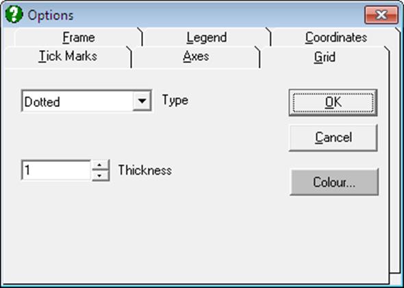
This dialogue is used to control the type, colour and thickness of the grid lines. If any, the grid lines are drawn through the tick marks. Therefore, their frequency can be controlled by selecting the appropriate interval values from the Edit → Axes dialogue.
Type:
None: Grid is not drawn.
Solid: A solid line is drawn through the tick marks.
Dotted: A dotted line is drawn through the tick marks.
Intersections: A dot is plotted at the intersection of two grid lines. This will create the best results with plotters, where the pen thickness would cause over-emphasised grid lines with any other option.
Thickness: Adjusts the thickness of the grid lines.
If the Axis option above is set to None, then the grid will not be drawn either.
2.3.4.3.4. Frame
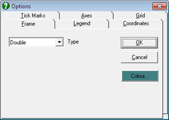
Use this tab to select the type (single or double) or colour of the frame or to redisplay the deleted frame object.
Type:
None: No frame is drawn.
Single: A single line frame is drawn.
Double: A double-line frame is drawn.
The colour, line style, thickness and other properties of the frame object can be controlled using the Drawing Toolbar.
2.3.4.3.5. Legend
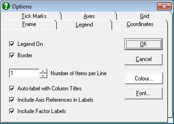
This dialogue can also be activated by double-clicking on the Legend Object.
Colour: The fill colour of the legend background can be selected.
Font: Font, colour, style and size of all text in legends can be edited via the standard Windows font selection dialogue.
Legend On: Switches the display of legend object on and off. If the legend object has been deleted, then it can be made visible again by checking this box (see 2.3.2.2.3. Legend Object).
Border: When checked, border lines (a box) will be drawn for the legend object.
Number of Items Per Line: Although the number of items per line is automatically adjusted according to the shape of the legend object, here you can enforce your own choice.
Auto-label with Column Titles: When this is checked UNISTAT will automatically assign the Column Labels (as displayed in Data Processor) to the legend items. Otherwise the legends typed in by the user from the Edit → Data Series dialogue or those loaded from the .USG files will not be changed by the program.
In most cases, it is desirable and also practical to represent Data Series by their column (variable) labels. UNISTAT uses the Column Labels in legend fields by default. However, sometimes the user needs to type in additional or completely new information which is not in the column label. In this case, although the graph can be plotted with the edited legend fields and this information could be saved to a .USG file, every time the user goes back to the Variable Selection Dialogue and then re-displays the graph, the edited legend fields would be replaced by Column Labels. Therefore, we recommend that this box should be unchecked if the legend fields are to contain information other than Column Labels. A similar control exists for axis titles (see 2.3.4.3.2. Axes).
Include Axis References in Labels: When a graph is drawn with more than one Y-axis, it is important to know which variable is represented on which axis. If this box and the Auto-label box above are checked simultaneously, then the program will prefix the legend texts with their axis references. For instance, if the Wages variable is represented on the left Y-axis and Interest on the third right Y-axis, then the legend will be automatically labelled with (L) Wages and (R3) Interest.
Include Factor Labels: When factor columns have been selected, you can display the factor names in the legend. See 4.1.1. X-Y Plots Categorical Plot.
The fill colour, fill style and border thickness properties of the legend object can be controlled by first selecting the legend with the mouse and then using the Drawing Toolbar.
2.3.4.3.6. Coordinates
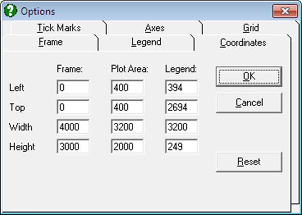
The size and location of three major graphics objects can be edited: frame object, plot area object and legend object. The logical origin is at the top left corner of the Graphics Editor and the logical size is 4000 units wide and 3000 units high.
The values displayed in this dialogue will always be the current values of these objects. To restore the original values click on the [Reset] button. These values are stored as part of the graphics template files (see 2.3.3.3. Save Template As).
The size and position of the printed image can also be customised by editing the top-left corner and the X-aspect and Y-aspect ratios given in the File → Print dialogue, without having to change any of these coordinate parameters.
2.3.4.4. Axes
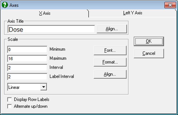
The minimum, maximum, interval and label interval values can be edited and font, size, colour, style and the number of digits displayed for the scale numbers can be set. For each axis, the Scale Type can be one of linear, log base 10, log base e, log based to any user-defined value (the default is 2), reciprocal, logit, probit, gompit (cloglog) or loglog independent of other axes.
Mathematical expressions (as well as numbers) can be typed into the four text boxes for axis range and intervals. For instance, to plot a trigonometric function between -3pi and pi, -3 * Pi() can be entered in the Minimum field and Pi() in the Maximum field. Likewise, for a natural logarithmic axis, one can enter -e() and e()^3. For the syntax and rules of mathematical expressions see 3.4.0.1. Entering Formulas. Once a function is entered, the program will replace the formula with its numeric result. The formula itself will not be stored.
2.3.4.4.1. Axis Title
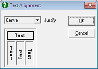
Editing axis title: This is a Rich Text edit box for entering and editing the selected axis title. Axis titles are standard text objects (see 2.3.2.2.4. Text Objects) and they can be copied and pasted to and from other Windows applications such as Word. They can also be edited using UNISTAT’s built-in Rich Text editor. To do this you need to close the axis dialogue and double-click on the title text object. Like other text objects, axis titles can be aligned in one of 0º, 90º or 270º rotations or top-to-bottom orientation. It is possible to mix different fonts (including symbols), subscripts and superscripts.
![]()
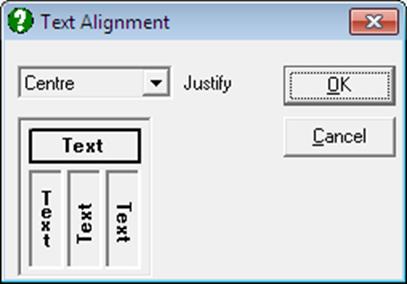
Align: A dialogue pops up allowing control of justification and orientation of the axis title.
2.3.4.4.2. Scale
The following parameters can be controlled.
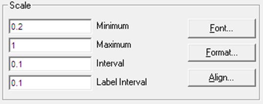
Minimum: This is the smallest value of the variable to be displayed on the axis. By default, this value will be a round figure smaller than the actual minimum of data, in order that all points lie within the plot area. A label tick mark will not necessarily be drawn for this minimum value if it is not a round enough figure. Mathematical expressions can be entered into this field, e.g. 2*Pi(), e()^2.
Maximum: This is the largest value of the variable to be displayed on the axis. By default, this value will be a round figure greater than the actual maximum of data, in order that all points lie within the plot area. A label tick mark will not necessarily be drawn for this maximum value, if it is not a round enough figure. Mathematical expressions can be entered into this field.
Interval: This is the interval at which minor tick marks (that is, tick marks without labels) are drawn. Mathematical expressions can be entered into this box. It is available for only linear and reciprocal scales. See Scale Type below.
Label Interval: This is the interval at which major tick marks (that is, tick marks with labels) are drawn. Major tick marks have a longer tick, a grid line and a label. Minor tick marks have a shorter tick and a grid line only. Mathematical expressions can be entered into this box. It is available for only linear and reciprocal scales. See Scale Type below.
Font: Fonts can be set for axis numbers from the standard Windows font selection dialogue.
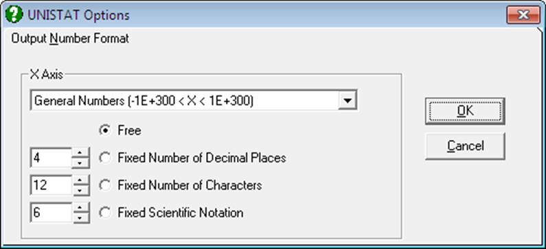
Format: This will activate the Number Format dialogue allowing numeric formatting of scale numbers.
Align: This will activate the text orientation dialogue allowing you to display the numbers or labels for X-axis major ticks in one of 0º, 90º or 270º rotations or top-to-bottom orientation. This option is available for only X-axis.
Display Row Labels: This control is available for only the X-axis. Most graph types will allow displaying alphanumeric labels for the X-axis tick marks, instead of numbers. If this box is checked, then the Row Labels will be displayed on the X-axis. In Stand-Alone Mode, these can be entered and / or edited in Data Processor. In Excel Add-In Mode, the row labels should be selected as the first column in the highlighted block of data.
The use of Row Labels in graphics requires more effort than plotting with numbers. Particularly, the X-axis interval must be chosen carefully to prevent labels overlapping.
Alternate Up/Down: This control is available for only the X-axis. It allows for printing major tick labels up and down along the X-axis, preventing overlapping.
2.3.4.4.3. Scale Type
In X-Y Plots (in fact, in almost any other 2D or 3D plot), it is possible to change the scale of an axis to one of linear, log base 10, log base e, log based to any user-defined value (the default is 2), reciprocal, logit, probit, gompit (cloglog) or loglog axes.
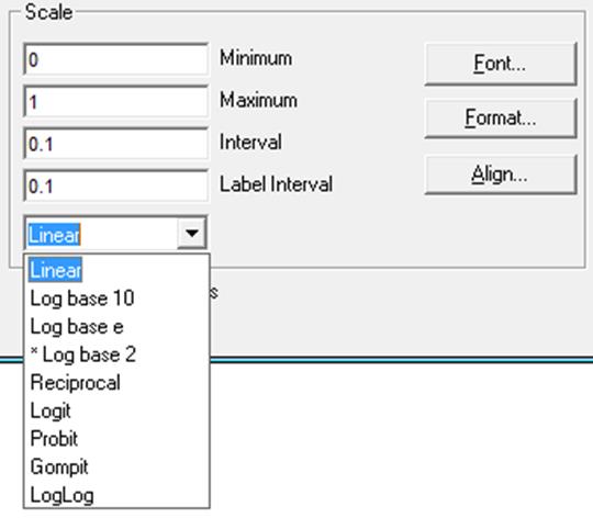
Linear: This is the default scale type. Automatic scaling is done such that a round figure which is smaller than or equal to the minimum observation and another round figure which is greater than or equal to the maximum observation in data are selected as the minimum and maximum scale numbers respectively.
![]()
Interval and Label Interval values can be edited to control the appearance of linear scale.
![]()
Log Base 10: When this option is selected, the program first scans the data for non positive values. If any negative or zero values are found, then an Illegal Interval message pops up and the selection is aborted. Otherwise, the axis is rescaled for logarithmic values (base 10) and the new (logarithmic) minimum and maximum values are displayed in the corresponding boxes. Instead of Interval and Label Interval text boxes used in linear and reciprocal scale dialogues, two check boxes Minor Ticks and Scientific Notation are featured in all logarithmic scale dialogues.
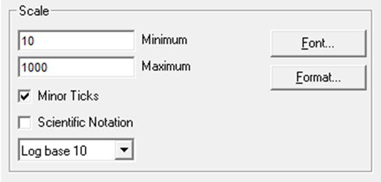
· By default, i.e. when Minor Ticks is checked and Scientific Notation is unchecked, minor tick marks are drawn between the powers of 10 and numbers are displayed in free format, as shown below. Between the powers of 10 numbers are displayed only if they do not overlap. Note that numbers 80 and 90 are not drawn below because there is not enough room for them.
![]()
· If Minor Ticks is unchecked then minor tick marks and numbers between the powers of 10 are not displayed.
![]()
· If Scientific Notation is checked then numbers are displayed in power form.
![]()
· When Minor Ticks and Scientific Notation are both checked, minor tick marks between powers of 10 are drawn but their numbers are not displayed.
![]()
Under certain conditions, the minimum and / or maximum values may not be displayed on the scale. To force these values to appear under all circumstances, enter the following line under the [Options] section of the Documents\Unistat65\Unistat65.ini file:
ForceFirstLastTick=1
Log Base e: An axis with a natural (e based) logarithm is similar to the one with Log base 10. The only difference is that in a log base e scale numbers are displayed for only major ticks. The e constant can be entered in minimum and maximum boxes as a mathematical expression, e.g. e()^5 for the fifth power of e.
![]()
* Log Base 2: Although the default base number is 2, this can be changed to any integer greater than 1. When this item is selected from the list, a dialogue pops up enabling you to enter a new base number:
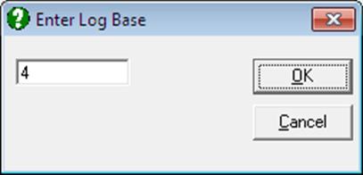
The new base number will be displayed in the drop-down list, preceded by an asterisk, indicating that this is a user-defined base number.
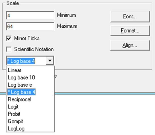
· Minor Ticks without Scientific Notation.
![]()
· No Minor Ticks with Scientific Notation.
![]()
Reciprocal: Variables containing strictly positive values are transformed using the reciprocal function:
F(x) = 1 / x
![]()
As in linear axis, Interval and Label Interval text boxes can be used to control the appearance of axis scale.
Logit: The next four scaling options, logit, probit, gompit (cloglog) and loglog, can be used with any data series containing values within the range 0 ≤ p ≤ 1. If the data contains values outside this range, an Illegal Interval message is issued and the selection is disallowed. However, as these functions are not defined for p = 0 and p = 1, the actual data range is limited to the interval 0.0001 ≤ p ≤ 0.9999. Values outside this interval (but within the range 0 ≤ p ≤ 1) are considered missing. Logit, probit, gompit (cloglog) and loglog scale options have neither Interval, Label Interval text boxes nor Minor Ticks, Scientific Notation check boxes (with the exception of gompit (cloglog) and loglog, which have the Minor Ticks box).
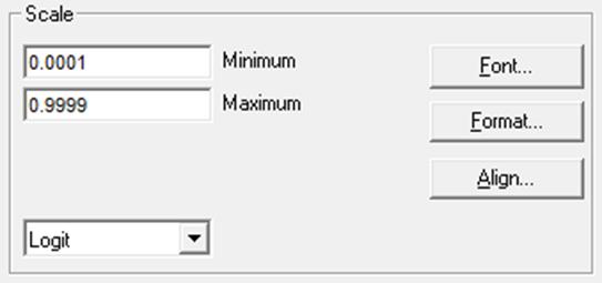
The logit function is a symmetric odds ratio for a given probability:
Logit(p) = Ln(p/(1-p))
Examples:
Logit(0.025) = -3.66
Logit(0.95) = 2.94.
![]()
Probit: For data range see logit. Probit is the inverse standard cumulative normal distribution function for a given probability value.
Probit(p) = Φ-1(p)
Examples:
Probit(0.025) = -1.96
Probit(0.95) = 1.64.
![]()
Note that a plot with a probit axis is different from a Normal Probability Plot.
Gompit: For data range see logit. Gompit (which takes its name from the Gompertz distribution) is an extreme value function related to Weibull distribution. It is also known as the log-Weibull or the complementary log log (cloglog) function (see 7.2.5.1. Logit / Probit / Gompit Model Description). Unlike logit and probit, gompit is an asymmetric function with a long right tail.
Gompit(p) = Ln(-Ln(1-p))
Examples:
Gompit(0.1) = -2.25
Gompit(0.9) = 0.834.
An X-Y plot with a gompit Y-axis and log base 10 X-axis is known as Weibull Chart and a printed form with these axes is called Weibull paper (or Weibull probability paper).
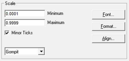
![]()
![]()
LogLog: For data range see logit. Loglog is an asymmetric function with a long left tail.
Loglog(p) = -Ln(-Ln(p))
Examples:
Loglog(0.1) = -0.834
Loglog(0.9) = 2.25.
![]()
2.3.4.5. Data Series
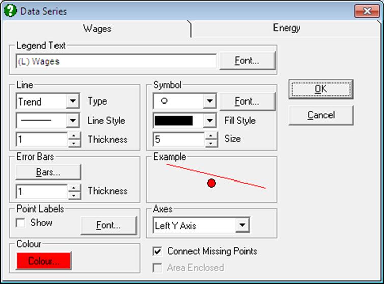
Many types of graphs have an option under the Edit Menu for the purpose of editing the graphics properties of the data series plotted. For instance, for X-Y Plots there is an Edit → Data Series option, in Plot of 2D Functions an Edit → Functions option and in Plot of Distribution Functions an Edit → Distributions option. Selecting these options usually produce tabbed dialogues, with each tab corresponding to a different curve being plotted.
These dialogues are specific to the procedures they belong, however most of them have the following groups of controls in common.
2.3.4.5.1. Legend Text
![]()
This text box displays the text which will be displayed in the legend object for a particular curve. In most cases this will be generated by the program automatically using Column Labels (see 2.3.4.3.5. Legend).
In some procedures (like Plot of 2D Functions), however, this text box will be labelled Function and it will be used to enter the formula of the function to plot. In this case the function entered for this curve will also be displayed as legend text.
Font: This button is used to change the font, colour, style and size of the text displayed in the legend. Changing the font for one curve will change all the others, as there is only one font assigned for all curves. The legend font can also be set from the Legend dialogue under Edit → Options → Legend.
2.3.4.5.2. Line
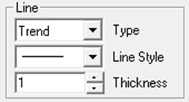
This group of controls is used to edit the properties of curves.
Type: You can select the type of curve to be drawn for each data series. The first option is None which is the default to draw scatter diagrams instead of line diagrams. Other options available are usually specific to each procedure, but will always contain a Straight line option. For X-Y Plots procedure, for instance, there are eight different line types available (see 4.1.1.1.1. Line).
Line Style: If any lines are drawn, their style can be selected via this drop-down list. Available options are solid, dash, dot, dash-dot-dot and dash dot-dot-dot.
Thickness: Thickness of the line can be assigned in printer units, which is about 1/8 of a pixel on the screen for a laser printer. The line style for a line can be only solid if it has a thickness greater than one.
2.3.4.5.3. Symbols
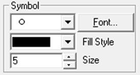
In most data plotting procedures there will be a Symbol group of controls. This provides access to a large number of symbols (up to a maximum of 260 at a time), with the ability to load any font or symbol set from file. It is possible to adjust the size of all symbols, and fill the interiors of a special set of 7 symbols with hatching patterns.
Type: By default, the drop-down list contains 10 symbols, which are generated by the program:
![]() None
None
![]() Cross
Cross
![]() Plus
Plus
![]() Star
Star
![]() Circle
Circle
![]() Square
Square
![]() Diamond
Diamond
![]() Up triangle
Up triangle
![]() Down triangle
Down triangle
![]() Right triangle
Right triangle
![]() Left triangle
Left triangle
Fill Style: Symbols 4 to 10, which define closed interiors, can be filled with solid colours or with one of the 8 hatching patterns provided by this drop-down list.
![]() Solid
Solid
![]() Blank
Blank
![]() Horizontal
Horizontal
![]() Vertical
Vertical
![]() Forward diagonal
Forward diagonal
![]() Backward diagonal
Backward diagonal
![]() Cross
Cross
![]() Diagonal cross
Diagonal cross
Size: You can click on the up or down arrows to increase or decrease the line thickness of the symbols. The thickness is in printer units, which is about 1/8 of a pixel on the screen for a laser printer.
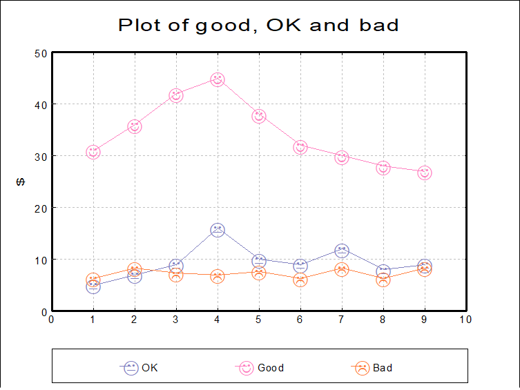
Font: Clicking on the [Font…] button within the Symbol collection of controls activates a small dialogue where the user can either load a font set into the symbols drop-down list or unload a font set that has already been loaded. In this way letters of the alphabet or other special fonts can be displayed as symbols. Font sets like Windings and Symbol are designed for this purpose.
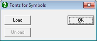
When a font set is loaded into the symbol drop-down list, the first group of symbols will always be the standard UNISTAT set as described earlier. Symbols from the font file will be appended to the end of the list.
2.3.4.6. 3D Viewpoint and Perspective
All 3D graphics procedures have an Edit → Viewpoint options dialogue. This allows a 3D graph to be rotated and viewed from different angles. It also provides the option to view the image in one of parallel, 1-, 2- or 3-point perspectives.
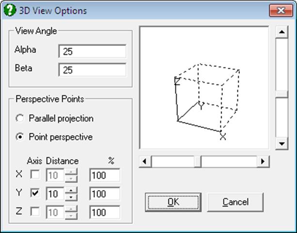
Three groups of controls are provided:
View Angle: Enter degrees of rotation for X and Y axes to select the desired viewpoint. The Z axis will always be perpendicular.
Rotating Cube: This provides a visual representation of the current selections for perspective types and angles. The cube can be rotated by clicking on the vertical and horizontal scroll bars situated next to the cube. As the cube rotates, the alpha and beta angles in the View Angle group will be updated.
Perspective Points: It is possible to select one of parallel or point perspective options. The latter permits selection of 1-, 2- or 3-point perspectives by checking the desired axes. It is also possible to change the distance from the cube to the viewpoint for each axis separately.
2.3.4.7. Contours
3D graphs with a surface display also have an Edit → Contours option. This allows the contour lines of the surface to be shown on either or both of the bottom and top planes of the 3D graph. Alternatively, a 2D contour map can be drawn with extended annotation possibilities.
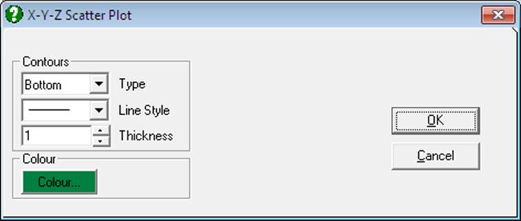
In X-Y-Z Scatter Plot procedure the Edit → Contours menu item will be disabled unless a surface is fitted on the data (see 4.2.1.5. Surface Fitting). Once a surface is fitted, selecting this menu item displays the Contours dialogue box.
The Type drop-down list provides the following choices:
None: Contours are not drawn.
Bottom: Contours are drawn on the bottom plane only (the default).
Top: Contours are drawn on the top plane only.
Both: Contours are drawn on both bottom and top planes.
2D Contours: A two dimensional projection of the contour curves is drawn with extended labelling. The frequency of contour curves can be adjusted by selecting the appropriate Z axis interval values.
