4.1.1. X-Y Plots
The Variable Selection Dialogue for this procedure allows plotting an unlimited number of data series. Each data series can be a column of the data matrix, or alternatively, a subsample of a data column defined by one or more factor columns. At least one data column must be selected by clicking on [Variable].
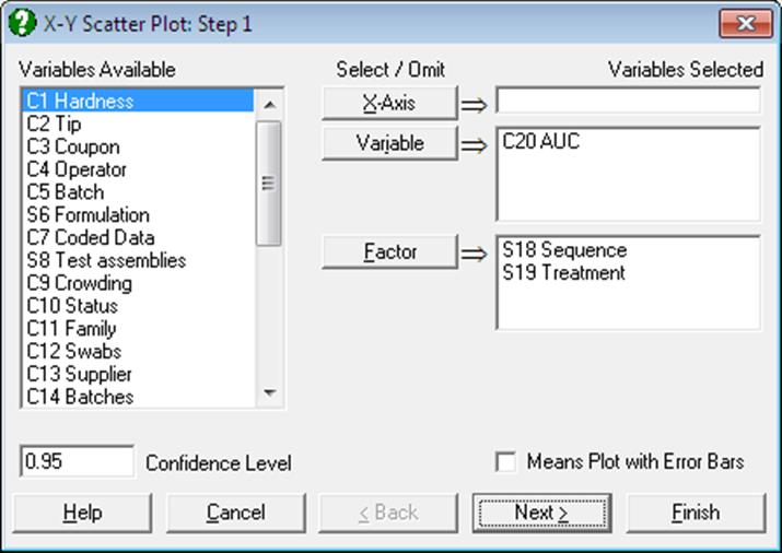
It is optional to select an X-axis column by clicking on [X axis]. If an X-axis column is not selected then the program will plot the Y-axis variables against the index (i.e. the row numbers). Each axis can have the Scale Type Log base 10, Log base e, log based to any user-defined value, reciprocal, logit, probit, gompit (cloglog) or loglog.
Categorical Plot: Selecting a [Factor] column is optional. In case one is selected, this will define the subgroups of the data column and each subgroup will be plotted as a separate series. If more than one [Factor] is selected, then combinations of factor levels will define the subgroups. An unlimited number of data and factor variables can be selected simultaneously. For more information on these data types see 5.0.1. Multisample Data Types. When at least one factor column is selected, a further dialogue pops up displaying a check list of all combinations of levels. You can then select the ones to be included in the plot.
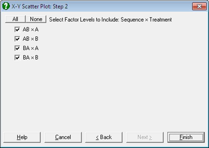
Factor labels are now included in legends and Point identification (see 2.3.2.3. Interactive Data Points).

If these labels take too much space, you can switch them off by selecting Edit → Options → Legend from the menu or by double-clicking on the Legend Object..
Means Plot with Error Bars: If this box on the Variable Selection Dialogue is checked, each point on the plot will represent the mean of a data series rather than an individual data point. For a detailed description of this option see 4.1.1.3. Means Plot. Note that Polar Plot, Bar Chart, Area Chart and Ribbon Chart procedures also support this feature.
Interactive Data Points: When the graph is still in Graphics Editor (i.e. before it is sent to an output medium such as Excel or Word), the data points plotted by this procedure are linked with the data in data matrix (see 2.3.2.3. Interactive Data Points). Move the mouse pointer over a data point and press down the right mouse button. A tooltip-like information panel will be displayed about that point until you release the right mouse button. If you are running UNISTAT in Stand-Alone Mode, the row of Data Processor containing this point will also be highlighted. If the delete key is pressed while highlighting a point, this point will be excluded from the plot and the graph will be redrawn. In Stand-Alone Mode, it is also possible to select a row of the spreadsheet to highlight the points on the graph which belong to this row.
Missing Values: Any x-y pairs with at least one missing value are treated as missing. If symbols are drawn without lines then a missing point will simply not exist on the graph. If however, the Line field is set to one of Line or Curve values, then there are two options provided for two points which have missing data between them: (i) leave a gap between them or (ii) connect them.
In the first case the lines will stop before a contiguous group of missing values and start again with the first non missing observation. This gives a much better understanding of missing data in a series compared with connecting the two points just before and after a block of missing values.
Unequal Column Lengths: Columns with different lengths can be selected for both X and Y axes. Any pair with at least one no data value will be considered as missing.
Date / Time X-Axis: When a date or time variable is selected for the X-Axis, the data points will be separated according to the time difference between them, taking care of leap years, if any. This is also called a true time axis. For further information see 3.0.2.5. Date-Time Data.
The number of options available under the Edit Menu depends on the number of columns selected for the graph. The Curve Fitting option will be available when only one Y-axis variable is selected.
4.1.1.1. Data Series
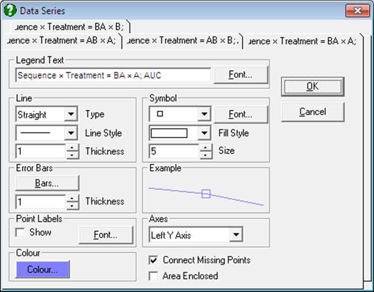
This dialogue provides control over all aspects of individual data series. To display settings for a data series click on the tab index for it. All controls are updated to display the settings for the selected series. The Example box will display the effect of current selections. It will be updated instantly for any changes in controls.
Although an unlimited number of data series can be plotted, properties of only the first nine can be individually controlled using this dialogue. The rest of the series will repeat the properties of the first nine in a circular fashion.
The following aspects of any data series can be controlled independently.
4.1.1.1.1. Line
Points can be connected by lines or curves, or a trend line can be fitted on each data series separately. These options are independent of the curve fitting options described below (see 4.1.1.2. Curve Fitting). It is possible, for instance, to draw a trend line, using this option and to fit a polynomial on the same data series using the Edit → Curve Fitting facility.
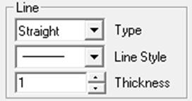
None: No lines or curves are drawn.
Line: Two consecutive x-y points (belonging to the same series) are connected by a straight line. The style of the line (e.g. dashed line, dotted line) can be selected from the Style list in the same frame. Lines will not be drawn for any x-y pairs with at least one missing value.
![]()
Curve: Cubic spline interpolation coefficients are computed for each data series. A curve passing through all points is drawn. This option will only work when the X-axis values are in strictly increasing order.
![]()
Trend Confidence and Prediction Intervals: A line of best fit (linear least squares) is drawn for the selected data series. When this option is selected from the Line Type list, a further dialogue will pop up allowing you to draw interval curves for the mean of Y (confidence) and / or actual Y (prediction) values at one or more confidence levels.
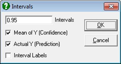
Either or both intervals or none can be drawn by checking the boxes as desired. The text box can be used to enter multiple confidence levels between 0 and 1, separated by spaces. When the last box is checked, a label will be printed for each interval curve.
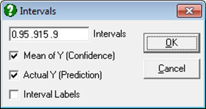
The two intervals are computed as follows:
1) Confidence interval for the mean of Y: This is the interval where expected value (mean) of the Y-variable can be located at a given confidence level.

2) Prediction interval for actual values of Y: This is the interval where an observation can be found at a given confidence level.

where X0 is any given value of X, the first term in brackets is the fitted Y value, the next term is the critical t-value for an α / 2 level of significance with n – 2 degrees of freedom. The next term is the estimate for the standard error of the disturbance term and xi is the difference between Xi and the mean of Xi.
For each run, intercept, slope and the correlation coefficient of the estimated trend line are saved in the following file:
..\Documents\Unistat10\Work\PolyCoef.txt
![]()
Ellipse Confidence and Prediction Intervals: When this option is selected, the same dialog shown above for the Trend option pops up. You can draw interval ellipses for the mean of Y (confidence) and / or actual Y (prediction) values at one or more confidence levels.
1) Confidence ellipse for the mean of Y: Assuming random variables X and Y are normally distributed, this is the region where the expected value (mean) of Y-variable can be found at a given confidence level. To draw the ellipse we first find the eigenvalues and eigenvectors of the covariance matrix between X and Y. Axes of the confidence ellipse along each eigenvector and around the mean are:
![]()
2) Prediction ellipse for actual values of Y: Assuming normality, this is the region where an observation lies at a given confidence level. For a 0.95 confidence level, approximately 95% of observations should lie within this ellipse. Axes of the prediction ellipse along each eigenvector are:
![]()
For each run, the estimated ellipse parameters (correlation coefficient, angle of inclination, two radii and the area enclosed) are saved in the following file:
..\Documents\Unistat10\Work\EllipseInfo.txt
![]()
Step Right: A horizontal line is drawn from the current point to the X coordinate of the next point. Then a vertical line is drawn connecting to the next point.
![]()
Step Down: A vertical line is drawn from the current point to the Y coordinate of the next point. Then a horizontal line is drawn connecting to the next point.
![]()
X-connect: A vertical line is drawn from the current point to the X-axis.
![]()
Y-connect: A horizontal line is drawn from the current point to the Y-axis.
![]()
O-connect (Vector lines): A line is drawn from the current point to the origin.
![]()
4.1.1.1.2. Symbols
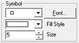
Hundreds of different types of Symbols can be selected for the X-Y points.
4.1.1.1.3. Error Bars
![]()
In most cases, a means plot can be generated automatically by checking the Means Plot with Error Bars box on the Variable Selection Dialogue of X-Y Plots (see 4.1.1.3. Means Plot). However, the error bars feature provided in the Data Series dialogue is much more powerful, allowing for horizontal and asymmetric error bars.
The [Bars…] button in the Error Bars group provides access to a Variable Selection Dialogue, where it is possible to select the following:
· Horizontal Error Bars
· Symmetric
· Left
· Right
· Vertical Error Bars
· Symmetric
· Up
· Down
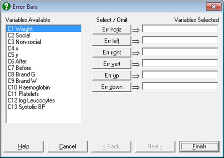
Any columns in the data matrix can be selected for the values of error bars. Horizontal error bars can be symmetric, in which case only one column is selected by clicking on [Err horiz], or they can be asymmetric in which case the column containing left-pointing bars is selected by clicking on [Err left] and the column containing right-pointing bars is selected by clicking on [Err right]. Simultaneously, and independent of the horizontal error bars, vertical error bars can also be symmetric, in which case only one column is selected by clicking on [Err vert], or they can be asymmetric in which case the column containing up-pointing bars is selected by clicking on [Err up] and the column containing down-pointing bars is selected by clicking on [Err down]. Error bars in any direction can be selected independently for all data series.
This method of displaying error bars assumes that you already have data column(s) in the spreadsheet (e.g. standard errors, standard deviations) to be displayed as error bars, prior to selecting the graphics procedure from the menu. If you are running UNISTAT in Stand-Alone Mode, you can easily generate columns containing means and standard errors for a range of data columns using the Range Statistics procedure in Data Processor. In Excel Add-In Mode, you can use one of Summary Statistics or Sample Statistics procedures with Output variables in rows option to create data for means and standard errors.
When calculating the new minimum and maximum axis values the program will take error bars into consideration. Therefore, after selecting error bars from this dialogue, it is normal to be warned by the program that the axes will be rescaled.
The size of the tip of the error bars can be controlled by entering and editing the following line in Documents\Unistat10\Unistat10.ini file under the [Options] group:
ErrorBarSize=9
Example 1: Asymmetric error bars
Open PARTEST and select Statistics 1 → Descriptive Statistics → Summary Statistics. Select Haemoglobin, Platelets, log Leucocytes, and Systolic BP (C10 to C13) as [Variable]s, check Output variables in rows and from the Output Options Dialogue select only the Mean, Standard Deviation and Standard Error options and click [Finish].
Summary Statistics
|
|
Mean |
Standard Deviation |
Standard Error |
|
Haemoglobin |
-0.5300 |
1.4629 |
0.4626 |
|
Platelets |
-0.0300 |
1.2193 |
0.3856 |
|
log Leucocytes |
-0.5900 |
1.5524 |
0.4909 |
|
Systolic BP |
3.1000 |
6.1545 |
1.9462 |
In Excel Add-In Mode, select the output matrix as data (including its row and column labels) and select Graph → 2D Plots → X-Y Plots. From the Variable Selection Dialogue select Mean as [Variable], leave the Means Plot with Error Bars box unchecked and click [Finish]. When the graph is displayed, select Edit → Data Series, select Line Type as Trend, check Mean of Y and Actual Y boxes and click [OK]. Also, check the Show Point Labels box. Then, click on [Bars…], select Standard Deviation (C2) as [Err up] and Standard Error (C3) as [Err down] and click [Finish].
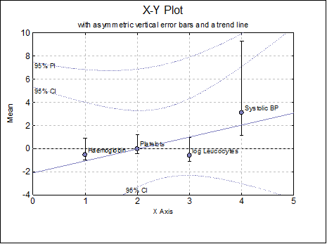
If we open the following file in a text editor:
..\Documents\Unistat10\Work\PolyCoef.txt
We can see the intercept, slope and correlation coefficient for the estimated trend line as:
Intercept = -2.095, Slope = 1.033, R = 0.757869472463919
Example 2: Ellipse intervals
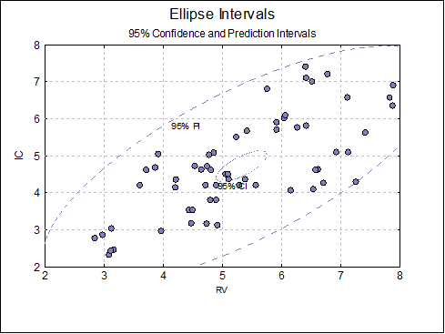
Open BLAND-ALTMAN and select Graph → 2D Plots → X-Y Plots. Select RV (C2) as [X Axis] and IC (C3) as [Variable] and click [Finish]. When the graph is displayed, select Edit → Data Series (or double-click at the middle of the plot area), select Line Type as Ellipse, check Mean of Y, Actual Y and Interval Labels boxes and click [OK] and [OK].
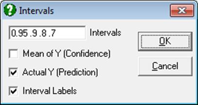
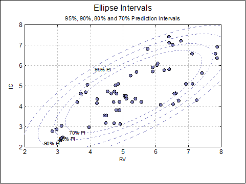
Again, select Edit → Data Series and Line Type as Ellipse, this time uncheck the Mean of Y box and enter 0.95, .9, .8, .7 separated by spaces.
The following plot is obtained.
And finally, if we open the following file in a text editor:
..\Documents\Unistat10\Work\EllipseInfo.txt
we can see the estimated ellipse parameters (correlation coefficient, angle of inclination, two radii and the area enclosed):
IC: 95% ellipse interval for Actual Y (Prediction), R = 0.732497355392092, Cos(Theta) = 0.721902996338242, r1 = 4.34310518313234, r2 = 1.70546708727243, Area = 23.2698488733639
IC: 90% ellipse interval for Actual Y (Prediction), R = 0.732497355392092, Cos(Theta) = 0.721902996338242, r1 = 3.78461845543149, r2 = 1.48615839162501, Area = 17.6700213244109
IC: 80% ellipse interval for Actual Y (Prediction), R = 0.732497355392092, Cos(Theta) = 0.721902996338242, r1 = 3.14504682463304, r2 = 1.23500896735682, Area = 12.2024517609114
IC: 70% ellipse interval for Actual Y (Prediction), R = 0.732497355392092, Cos(Theta) = 0.721902996338242, r1 = 2.71061626812935, r2 = 1.06441512157569, Area = 9.06418892349461
4.1.1.1.4. Point Labels
![]()
This option is useful for tracing the locations of individual x-y points. When the Show box is checked, Row Labels will be drawn next to the x-y points. If there are no Row Labels then the row numbers will be printed.
In Stand-Alone Mode, Row Labels may be entered and edited using the Data Processor’s Edit → Row Labels facility. In Excel Add-In Mode, Row Labels are assumed to be in the first column of the highlighted block and the first column should be selected as row labels rather than data (see 1.3.2. Excel Add-In Mode).
By default, the colour of point labels is selected from the Font dialogue and the colour selected applies to all point labels. If you wish to display point labels in the same colour as the series line and symbols, enter the following line in Documents\Unistat10\Unistat10.ini file under the [Options] group:
PointLabelSeriesColour=1
4.1.1.1.5. Right Y-Axes
![]()
Each Y-axis variable can be displayed independently on the left Y-axis or on one of four right Y-axes, by means of the Axes drop-down list.
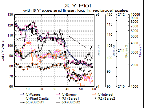
The program will scale each axis separately, for the variables selected for that particular axis. The legend for each Y-axis variable will also contain either an L or R1, R2, …, indicating to which axis this variable belongs.
4.1.1.1.6. Area Enclosed
![]()
The area enclosed between a data series and the Y = 0 line (not the minimum of Y-axis) can be computed for each variable separately. The area enclosed is displayed in the legend when all of the following conditions are met:
· X-Axis variable is strictly increasing,
· Y-Axis variable is nonnegative,
· line type is Straight for the variable,
· no Curve Fit option is selected.
The area enclosed under the curve is displayed in the legend for each variable.

If the Connect missing points box is not checked, only the area under the lines drawn between data points is computed.
4.1.1.2. Curve Fitting
Five different types of curves can be fitted on a bivariate plot, that is, when only one Y-axis variable is selected. This option will not be available if more than one Y-axis variable has been selected.
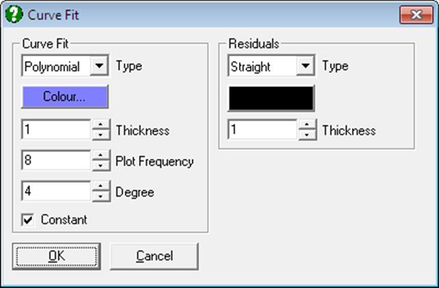
A new feature with this version of UNISTAT is the facility to display residual bars on the series. When the Type is Straight, vertical lines connecting each data point to the fitted curve will be drawn. It is possible to control the colour and thickness of residual bars and whether they are to be displayed or not.
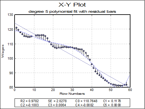
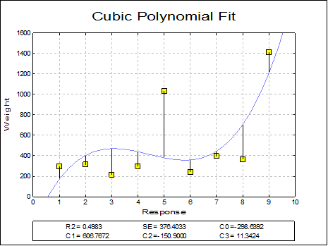
In addition to the R-squared and standard error values, coefficients of the fitted equation are displayed in the legend for polynomial, geometric and exponential fits. In Stand-Alone Mode, it is also possible to run interpolations on the fitted curve, without having to retype these coefficients, using the Data Processor’s Reg function (see 3.4.2.6.3. UNISTAT Functions). The same coefficients will also be saved automatically in the file POLYCOEF.TXT, in the order of constant term (if any), X^1, X^2, …, X^r for a degree r polynomial.
Neville: For a variable containing r observations, coefficients of a degree r – 1 polynomial passing through all points is calculated. X-axis values must be strictly increasing. Typically, this is a polynomial wildly oscillating at extreme x values. The amount of computing time will increase quickly with increasing r.
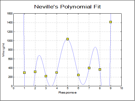
Rational: Rational functions are quotients of polynomials. Like the Neville’s polynomial, this procedure will also draw a curve passing through all points, but it will probably have many points of discontinuity. These are the points where the denominator of the rational function approaches zero. Like Neville’s polynomial, it is not practical to fit rational functions on large series due to intensive computing requirements. X-axis values must be in strictly increasing order.
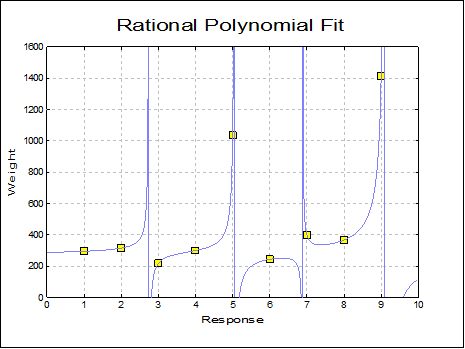
Polynomial: When this option is selected, two new controls Degree and Const will be placed in the Curve Fit dialogue. In this way, you are provided with the possibility of fitting polynomials of any degree and with or without a constant term. A line of best fit (i.e. the plot of bivariate regression) is equivalent to fitting a first degree polynomial.
A dedicated Polynomial Regression algorithm is used to estimate the coefficients of the least squares fit. The estimated coefficients, R-squared and standard error of regression are displayed. If values of the column selected for X-axis are too large and a high degree polynomial fit is attempted, then a number overflow may occur. Although this error will be trapped by the program in most cases, it cannot be guaranteed that all overflow errors can be trapped. Some errors may result in a crash causing loss of data.
WARNING! You must ensure that the combination of X and Y-axis values and the degree of the polynomial fitted are low enough not to cause a number overflow.
Even if a crash does not occur, the precision of fits will be poorer with large X-axis values. All this can be easily overcome by scaling down the values of the column to be chosen as X-axis before fitting a polynomial. For instance, if the X-axis consists of years 1950 to 1999 then much better results can be obtained by changing these values to 50 to 99.
The estimated coefficients are saved in memory so that they can be shared by the Plot and Roots of Polynomials procedure. Therefore, once a polynomial is fitted on data it is possible to plot the estimated polynomial in any interval and also to determine its roots by choosing the Plot and Roots of Polynomials procedure.
In Stand-Alone Mode, it is also possible to run interpolations on the fitted curve, without having to retype these coefficients. This is done using the Data Processor’s Reg function (see 3.4.2.6.3. UNISTAT Functions). The same coefficients will also be saved automatically in the file POLYCOEF.TXT, in the order of constant term (if any), X^1, X^2, …, X^r.
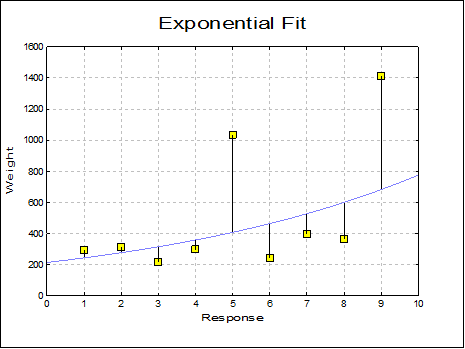
Exponential: The following least squares model (exponential regression) is fitted on data:
![]()
The equation is first linearised as:
![]()
The constant term can be omitted. If the y variable contains non positive values, then the program reports data as unsuitable for exponential fit.
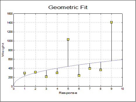
Geometric: The following least squares model (geometric regression) is fitted on data:
![]()
The equation is first linearised as:
![]()
The constant term can be omitted. If one of the X or Y variables contains non positive values, then the program reports data as unsuitable for geometric fit.
4.1.1.3. Means Plot
The Variable Selection Dialogue of X-Y Plots, Polar Plot, Bar Chart, Area Chart and Ribbon Chart procedures support a Means Plot with Error Bars check box. When it is checked, each point on the plot will represent the mean of a data series rather than an individual data point. By default, the program also plots the standard error of mean for each point in the form of a symmetric vertical error bar. It is possible to switch off the display of error bars or select other measures of dispersion.
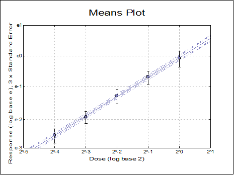
It is also possible to select a continuous variable for the X-Axis, where one or more Y-Axis variables have multiple values corresponding to the same X-Axis variable value. A typical case is the dose-response plot where there are several response variable values for each dose level. When one more factor variables are also selected, the X-Axis selection will be ignored.
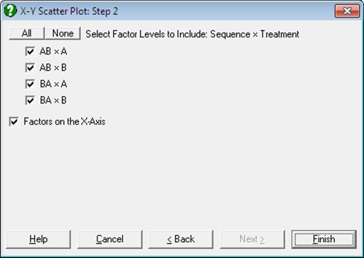
If one or more factor columns are selected, then the means of subgroups defined by combinations of factor levels are plotted. In this case a further dialogue pops up, displaying a check list of all combinations of levels. This dialogue also contains a check box Factors on the X-Axis, which is used to determine whether the variables or the factors will be represented on the X-Axis.
When only one factor is selected, Means Plot looks similar to Profile Plot of GLM procedure (see 7.3.2.3. GLM Output Options).
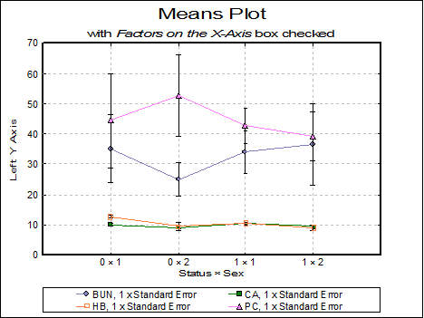
The following example illustrates a Means Plot with four variables, two factors and the Factors on the X-Axis box checked. Here, the combination of factor levels are represented on the X-Axis and variables in different lines.
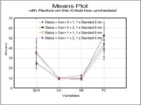
This example is for the same set of variables with the Factors on the X-Axis box unchecked. Here variables are represented on the X-Axis and factor levels in separate lines.
The Error Bars control on the Edit → Data Series dialogue for Means Plot allows selecting one of the following dispersion measures.
· None
· t-interval
· Z-interval
· Standard Error
· Standard Deviation
· Variance
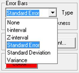
Selecting a new error bar type from the list will enforce a re-scaling of the relevant axis. The confidence level for t- and Z- intervals can be set from the Variable Selection Dialogue.
When one of Standard Error or Standard Deviation options is selected, a dialogue pops up asking for a multiplier.
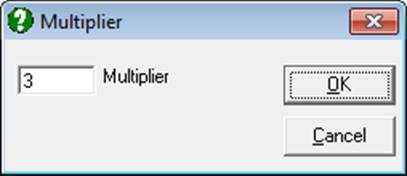
Error bars for standard error will then be calculated as:
![]()
![]()
and for standard deviation:
![]()
![]()
where k is the multiplier defined by the user.
