4.3.3. Area Chart
This procedure is similar to Bar Chart procedure, in that it has exactly the same Variable Selection Dialogue and allows drawing charts with two independent Y-axes and with up to three additional columns as lines. The latter have the usual options of connecting with straight lines, curves (cubic spline) or trends. Error bars can also be drawn on any data point. The Means Plot with Error Bars check box allows plotting means of series with their error bars (see 4.1.1.3. Means Plot).
There are two differences from bar charts. The first is that here the Cluster option is not present, since it does not have any meaning in the context of Area Chart.
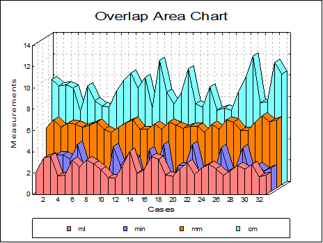
Overlap: Choose the sequence of the columns to be plotted that will maximise the visibility of all the data series by selecting them from the Variable Selection Dialogue in the desired order. Further control over the appearance of the chart can be achieved by means of allocating columns between Left and Right Y-axes.
Overlap Area Chart with and without depth will look radically different. When the depth option is on, the overall depth of the chart will depend on the number of columns.

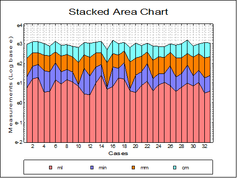
Stacked: Data series will be drawn additively with a new Y-axis scaled to display the maximum row sum.

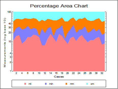
Percentage: Individual observations are scaled such that the sum of values for a row is 100.

