9.3.0. Overview
9.3.0.1. Control Charts
A control chart consists of a lower control limit (LCL), an upper control limit (UCL) and a centre line (CL). Samples are taken in time series order and plotted on the control chart. The centre line represents no deviation from the sample characteristic. The control limits are selected so that if the process is in control, almost all of the points will fall within the control limits. A point falling outside the control limits is an evidence of the process being out of control. Even if all the points lie within the control limits, the process can still be out of control. This condition exists when the points fall in a systematic manner, e.g. if the last 10 samples were above (or below) the centre line.
A control chart is a visual hypothesis test. The null hypothesis is that “the variable’s true value is the target level”. The control lines are set such that the sample would not take values outside the control lines. The typical value for the control lines is target level ±3 standard deviations, so if the null hypothesis holds then only 0.2% of the sample values should lie outside the control lines.
Selection of data columns to be analysed is specific to types of control charts (see 9.3.1. Variable Control Charts and 9.3.2. Attribute Control Charts). The following sections summarise the aspects common to most control charts.
9.3.0.2. Control Chart Inputs

UNISTAT will suggest values for these parameters based on the data.
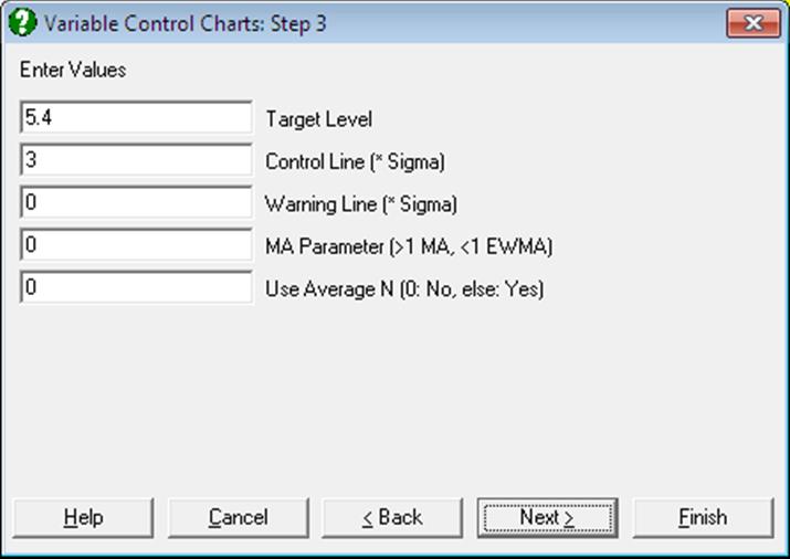
Target Level: The centre line for the chart.
Sigma: The standard error of the variable. On some charts this is related to the target level and hence not requested.
Control Line: The control lines will be at target level ± control line times sigma.
Warning Line: Warning lines will be added at target level ± warning line times sigma. If this value is zero then warning lines will not be drawn. A typical level for warning lines is 2 times sigma then you would expect 5% of points to lie outside the warning lines.
MA Parameter: UNISTAT will add either the standard moving average or the exponential weights moving average of the data to the chart. The following ranges of values can be entered:
0 No moving average line,
0-1 Exponential weights moving average is added to the chart,
1- Standard moving average of data is added to the chart.
Use Average N: The control / warning lines will be calculated using the average value of sample size. This will result in the control / warning lines being straight.
9.3.0.3. Control Chart Output Options

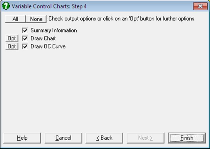
After the calculations for a chart have been made, two or three output options become available. An OC Curve option is not available for all control charts:
Draw Chart: Draws the quality control chart (see 9.3.0.4. Control Chart Options).
Summary Information: For each sample, the control variable, the LCL and the UCL are displayed in a table. Also, any samples outside the control limits are marked.
Draw OC Curve: Draw the Operating Characteristics Curve for the data (see 9.3.0.5. Operating Characteristic Curve).
9.3.0.4. Control Chart Options

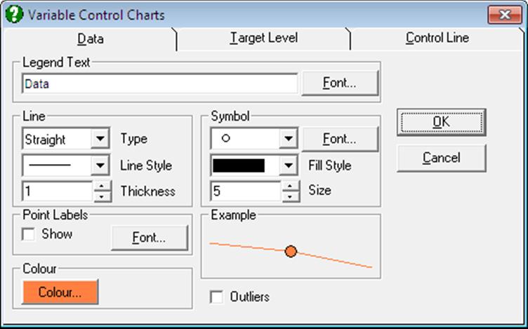
In the Edit → Data Series dialogue, the Point Labels and Outliers check boxes work in the following way:
Data Values: If Outliers and Point Labels are both checked then only outlying points will be labelled. If Point Labels alone is checked then each point is labelled.
Target Level: If Point Labels is checked then the target level will be shown on the right Y-axis. The Outliers check box has no effect.
Control Lines: If Point Labels is checked then the final control level is shown on the right Y-axis. This is most useful when average N values are used. If Outliers is checked then a box is drawn around the points which lie outside the control lines.
Warning Lines: If Point Labels is checked then the final warning level is shown on the right Y-axis. This is most useful when average N values are used. If Outliers is checked then a box is drawn around the points which lie outside the warning lines.
9.3.0.5. Operating Characteristic Curve
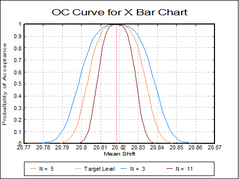
The Operating Characteristic Curve (or OC curve) shows how sensitive the current control chart is. It is a graph of the probability of accepting a sample with a true level as shown on the x-axis. This is usually referred to as the Type II or beta error probability.

The OC chart is generated on an X Bar Chart. This shows that with the current average sample size of 5, there is a 70% chance of a sample (with an actual mean of 20.80) lying outside the control lines. If the sample size was increased to 11 then there would be 98% chance of the point lying outside the control limits.
