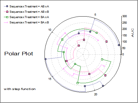
4.1.2. Polar Plot
The Variable Selection Dialogue for this procedure is similar to that of X-Y Plots. It is possible to plot an unlimited number of data series. Each data series can be a column of the data matrix, or alternatively, a subsample of a data column defined by one or more factor columns. The Means Plot with Error Bars check box allows plotting means of series with their error bars (see 4.1.1.3. Means Plot).
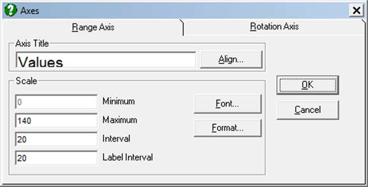
In both cases it is optional to select a data column for the Rotation axis (which is equivalent to X-axis in X-Y Plots) by clicking on [X axis]. If an X-axis variable is selected then the default is a Polar Plot in degrees. If an X-axis variable is not selected then the default is a star diagram. In this way, the Polar Plot procedure can draw true polar plots or star diagrams. The number of units per revolution is controlled using the rotation scale option. The maximum value is the value per revolution. Hence, to set up a Polar Plot in degrees, the maximum value should be 360. To set up a Polar Plot in radians the maximum value should be 2 x Pi().

An unlimited number of data series can be plotted, but properties of only the first nine can be controlled from the Edit → Data Series dialogue. The rest of the series will repeat the properties of the first nine in a circular fashion.
The check box Draw Circular controls whether the Polar Plot should always be drawn as a circle. Otherwise the plot will be drawn as an oval filling up the available space. The Connect Last Point check box for each line controls whether a line should be drawn from the last point in the series to the first point in the series. This allows star diagrams to be drawn. A line will only be drawn if a line style is selected for the particular data series.

Interactive Data Points: When the graph is still in Graphics Editor (i.e. before it is sent to Excel or Word), the data points plotted by this procedure are linked with the data in data matrix (see 2.3.2.3. Interactive Data Points). Move the mouse pointer over a data point and press down the right mouse button. A tooltip-like information panel will be displayed about that point until you release the right mouse button.
Missing Values: Any pairs with at least one missing value are treated as missing. If symbols are drawn without lines then a missing point will simply not exist. If however, the Line field is set to one of Line or Curve values, then there are two options provided for two points which have missing data between them: (i) leave a gap between them or (ii) connect them.
In the first case the lines will stop before a contiguous group of missing values and start again with the first non missing observation. This gives a much better understanding of missing data in a column than that obtained by connecting the two points just before and after a block of missing values.
Unequal Column Lengths: Columns with different lengths can be selected for both X and Y axes. Any pair with at least one no data value will be considered as missing.
